In the ever-evolving landscape of furniture parts industry, Furnastra emerges as a distinct and specialized brand under the well-established umbrella of Mitsu. This strategic branding move ensures a dedicated focus on ergonomic, durable, and high-quality furniture parts while maintaining the legacy of trust, quality, and innovation that Mitsu has upheld for over 35 years.
Furnastra is not just about furniture—it is about providing care, comfort, and seamless functionality every environment. The brand embodies the principles of precision, trust, and innovation, ensuring that every piece of furniture supports the well-being of its users.
The brand name itself is inspired by two Sanskrit words:
“Shastra”, meaning manual or guide, symbolizing expertise and authority in hospital furniture solutions.
“Nakshatra”, meaning star, signifying excellence, aspiration, and guidance.
This fusion reflects Furnastra’s commitment to guiding the industry with top-tier solutions, just as a star provides direction.
The Story Behind the Logo
1. The Symbolism of the Stylized “F”
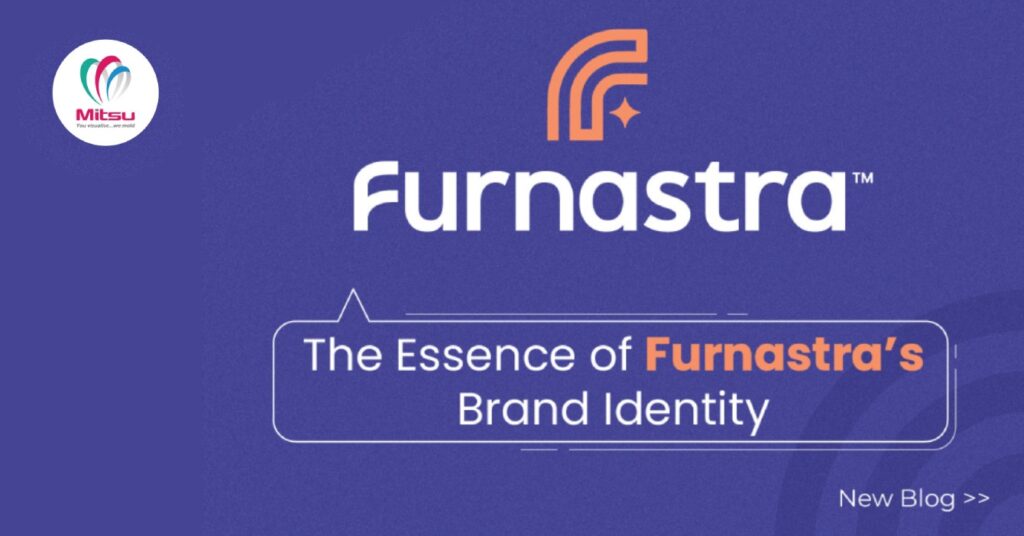
The Furnastra logo is more than just a name—it tells a story. The stylized “F” in the logo is a powerful representation of:
- Sleek, ergonomic furniture design – The smooth, continuous curves mirror the carefully crafted, functional designs of Furnastra’s hospital furniture parts such as the head bow, side railings as examples.
- Seamless integration of function and aesthetics – A crucial aspect where every detail matters.
- Trust and reliability – The fluid yet structured design represents stability and dependability, key attributes for a furniture-focused brand.
2. The Subtle Star Element
A small sparkle next to the “F” is a nod to the brand’s celestial inspiration—Nakshatra (star). This design element conveys:
- Guidance and excellence – Just as stars illuminate the night sky, Furnastra aims to lead the way in furniture parts.
- Aspirations for innovation – Reflecting a forward-thinking approach to furniture industry.
3. Color Palette: A Blend of Professionalism and Warmth
The Furnastra color palette is carefully curated to balance trust, calmness, and innovation while maintaining warmth and approachability.
Primary Colors:
- Modern Purple – A fresh alternative to conventional blues, symbolizing trust, reliability, and innovation.
- Warm Orange – A touch of care and positivity, evoking a sense of comfort.
Accent & Neutral Colors:
- Soft blues and neutral grays provide balance, ensuring clarity and stability while maintaining a calming and professional tone.
Together, these colors establish a distinct, trustworthy, and welcoming identity that aligns perfectly with Furnastra’s core values.
A Distinct Identity with a Legacy of Trust
Furnastra is more than just a brand—it is a promise of excellence. While it now stands independently as a specialized furniture parts brand, it remains deeply rooted in Mitsu’s 35-year legacy of quality and trust. This transition allows Furnastra to carve out its unique space in the healthcare industry, offering highly specialized solutions while upholding the standards of innovation and reliability.
The Furnastra brand, with its thoughtful logo, purposeful name, and carefully curated identity, is designed to be a beacon of excellence in the industry. Recognized for its unique brand philosophy and strong visual identity, Furnastra has also secured its trademark, further solidifying its position as a trusted name. With a clear brand philosophy, a strong visual identity, and a commitment to quality, Furnastra is set to lead the way in transforming spaces with functional and operational efficiency.


